Thursday, 17 January 2013

Final movie poster

Above is my Final Poster for my horror film after attempting with various techniques. My inspiration for this poster came from the sight and sound magazine covers, I liked the maturity of their covers and how they take something simple but make it effective and have an impact on the reader. I also like how when you look at sight and sound covers after the first few seconds of looking at the cover you will know what you are going to see throughout its content and that is what i wanted to try and show in my poster; I wanted to create something where you know basically what is going to happen by the tag lines and quotes yet you still question the movie. I wanted my poster to look like it came from an independent film company so that it would attract the more mature, cerebral audience instead of the type of audience horrors normally attract which is teenagers who are immature. By creating my poster with an indie look it makes people realise it wont have the same cliches that a horror made by a well known company would have and to make it stand out against other films of its genre. One thing I like about my poster is how everything is kept from the middle downwards and the top half of the poster is left bare, this is so that everything you need to know it all focused around the picture, which catches your attention first, once you have noticed the picture the writing around it is then your next source of attention and you start relating things together and questioning things about the poster. I also like how the red used is not what you would normally see on a horror poster, the typical black and white, it catches your attention because it is bright but also relates to danger and blood the type of things you'd relate to that colour associate as well with horror. Due to having these type of colours the white writing stands out and is easy to read unlike some posters you might read, also the font of the writing makes it look like it is a documentary which is the type of thing i wanted to show in my poster like 'the blair witch project'. I created this poster by using my own images that I had taken and editing them using the programme Photoshop and the various editing tools that it has installed on it. Overall I am pleased with the out come of my poster and I think it has an effective final look to it.


Inspiration 3


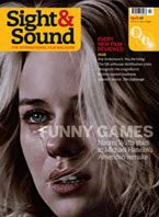
This magazine cover by sight and sound has influenced my decisions for my poster and magazine cover. It has made me want to create both pieces of my work using a simple effect and not over crowding the page so therefore it is easy to focus on everything on the cover without ignoring any bit of information given. I think the image used is effective as it as if she is looking at the audience and it draws your attention to want to read it; although the writing over the face 'funny games' gives the cover a witty tone to it. With this magazine being quite indie and not your typical mainstream magazine it makes it more interesting a for a specific type of audience which is what I want my magazine and poster to be like. One thing I do not like about this cover is the yellow in the right corner with the barcode in it I think it takes up too much space and draws attention away from other things on the poster.


Above is another magazine that has inspired me for my own movie magazine, one reason this has inspired me is for the simplicity of the colours, I want to use basic colours in my own magazine that you would only recognise for my magazine and not associate it with any others like what is used for this magazine. I also will use similar quotes to this magazine in my own work to make it seem more realistic and like something you would actually see in a store. One thing I do not like is I find the cover to be too crowded with text and I would make it more simpler in my own work.